8 min read
The first online store for one of Venezuela's largest pharmacy chains, and the internal system its team uses to manage every order.
Overview
Farmacias Nuevo Siglo has more than 40 branches across Venezuela, but before this project the only way to buy from it was at a branch or over WhatsApp. I designed its first online store, for phone and desktop, along with the internal system its team uses to manage orders from payment to delivery.
The context
Nuevo Siglo is one of the largest pharmacy chains in Venezuela. Most of its branches are in the center and west of the country, and it keeps opening in new states. Online, though, all it had was an institutional website. The project reached me through the developer who would build it, and the brief was clear. They wanted a custom store that was easy to use, showed what was in stock at the branch the customer chose and let them buy from more than one branch in the same order, while the pharmacy handled the logistics.
People of all ages would use it, so it had to be optimized for phones and run in the browser, with nothing to download. The pharmacy's team also needed a way to manage online orders, which until then came in over WhatsApp and weren't recorded in one place.
The challenge
Every branch has its own stock. A customer might find one medicine at the branch near home and another only at a branch across town. The hardest part was designing a cart and a checkout that handled products from several branches, two delivery options and several payment methods, without making buying medicine feel like paperwork. Some of those payments, like Pago Móvil, Zelle and bank transfers, also have to be checked with the bank by hand before an order can move forward.
Process
I started by studying the competition, looking at what other pharmacy stores did well and where they fell short, and gathered references from pharmacy stores in other countries. I also met with the pharmacy's staff to learn which problems they dealt with every day and how the new store could make their work easier.
From there I built an extensive component library, with every state each piece could be in: available, out of stock, in-store only, empty and error. Handoff ran through the whole project. I met with the developers constantly, annotated the prototype and reviewed the site as they built it.
Designed for the phone first
I designed every screen for both desktop and mobile, but the phone set the rules. On mobile, the search bar and the cart sit at the top of every page, filters fit into a single button, and the ones you apply show up as chips you can remove with one tap. Search, built by the developer, finds products by active ingredient, brand name or a close spelling. When it still finds nothing, the page says so plainly and suggests checking the spelling.
Your nearest branch, from the first visit
Since stock and delivery times depend on the branch, the store needs to know which one is yours. On the first visit, it asks for your location and picks the nearest branch on its own, and you can change it whenever you want. A closer branch means faster deliveries and an easier trip if you'd rather pick up in store. The branch locator lets you search by state, city or name, and shows each branch's distance, address, hours, whether it's open right now and how to get there.
Know it's in stock before you leave home
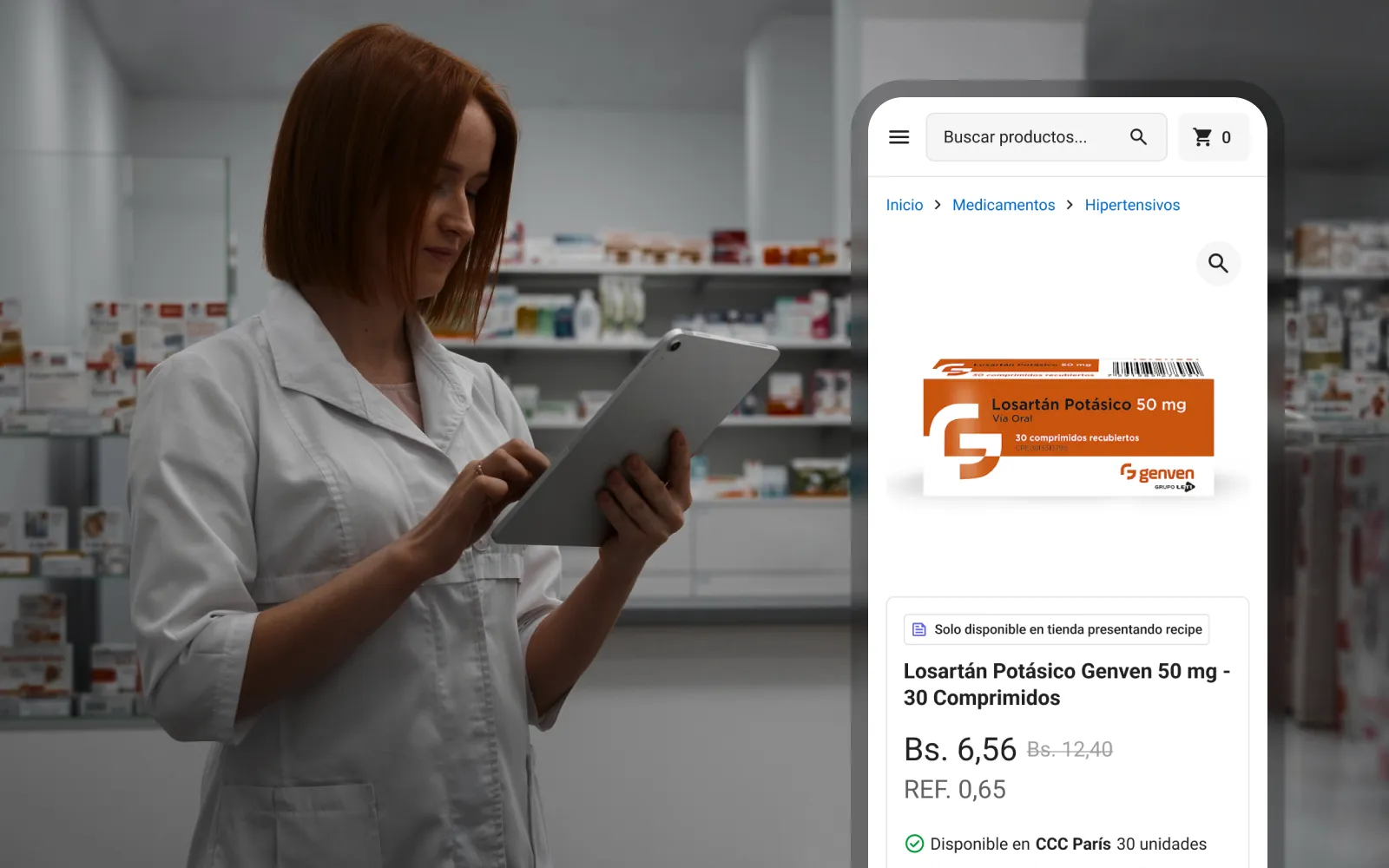
Each product shows whether it's available at your branch and how many units are left. If it's out of stock, a link shows which other branches have it, and you can add it from there. Prescription medicines carry a clear label saying they're only sold in store with a prescription, so nobody gets to checkout only to find out they can't buy them.
One cart, several branches
The cart groups products by the branch they come from, with that branch's address, so it's always clear where each item ships from. You can change quantities or remove items right there, and if the order includes more than one branch, the checkout warns you before you pay so you can double-check it.
Checkout on a single page
This is the decision I'm proudest of. Everything happens on one page: you choose home delivery or in-store pickup, change the address, pick a payment method and apply a coupon. For payments the bank has to verify, like Pago Móvil or Zelle, the page shows the pharmacy's account details and lets you report the payment right there, without leaving checkout. Once the order is placed, you get a confirmation on your phone, and preparation starts as soon as the team confirms the payment.
Behind the store: one place for every order
Orders are handled from a central office in each state where the pharmacy operates. Before, online sales came in over WhatsApp and weren't recorded in one place, so I designed an internal system that brings them all together. Each order moves through clear stages, from payment confirmation to invoicing, preparation, delivery and done, and at any point the team can contact the customer or cancel the order.
There are three roles. Administrators have access to everything and create the other users. Operators use the system the most. They check each payment against the bank, assign drivers and keep orders moving. Drivers only see orders that are on their way, delivered or canceled, and they close each delivery by entering the six-digit code the customer received or by scanning a QR code.
Following the order
Customers follow the same stages from their side. Each order has a progress line with the time of every step and, once it's out for delivery, the driver's name, license plate and a button to contact them.
Where it stands
The store is live at farmaciasnuevosiglo.com and, apart from the promotional banners, which the pharmacy's team creates, it matches the design. For the first time, Nuevo Siglo sells online, and its team tracks every order in one place instead of across WhatsApp chats.
What I'd improve
Today, you have to log in to open the cart. The account is needed for billing, but asking for it that early can turn away people who just want to see what they'd pay. I'd let anyone fill their cart and ask them to sign in only when they're ready to check out.